%22%2F%3E%3Cpath%20d%3D%22M0%20620c140-120%20260-180%20360-180s220%2060%20360%20180%20260%20180%20480%20180V800H0z%22%20fill%3D%22%23bfdbfe%22%2F%3E%3Ccircle%20cx%3D%22980%22%20cy%3D%22170%22%20r%3D%2272%22%20fill%3D%22%2393c5fd%22%2F%3E%3C%2Fsvg%3E)
Culture•Martyrs' Day, nepal•Jan 30, 2026
Martyrs' Day of Nepal: A Commemoration of Sacrifice
Explore the significance and history of Martyrs' Day in Nepal, a day dedicated to honoring those who fought for democracy.
Exploring the emerging trends and attractions that make South Asia a top travel destination for 2025.
Explore the significance and history of Martyrs' Day in Nepal, a day dedicated to honoring those who fought for democracy.
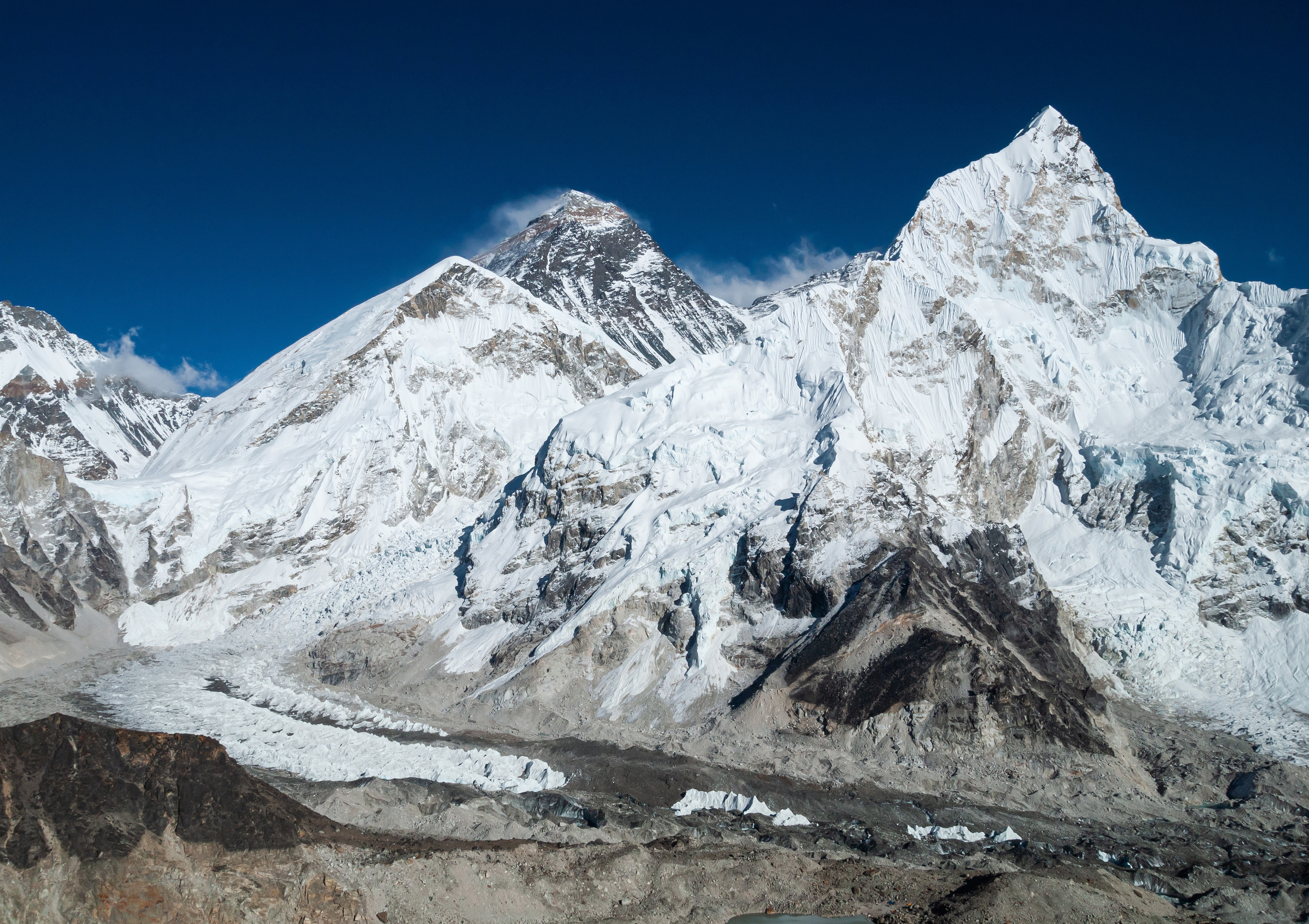
Explore the rich cultural and historical significance of Everest Base Camp, examining its role as a human landscape, the Sherpa migration history, and the contrasting experiences of travelers from Nepal and China.
This long-form article explores the historical migration of Sherpa communities to Solukhumbu, detailing their ancestral origins, the motivations behind their migration, and the cultural landscape they shaped in the Himalayas.
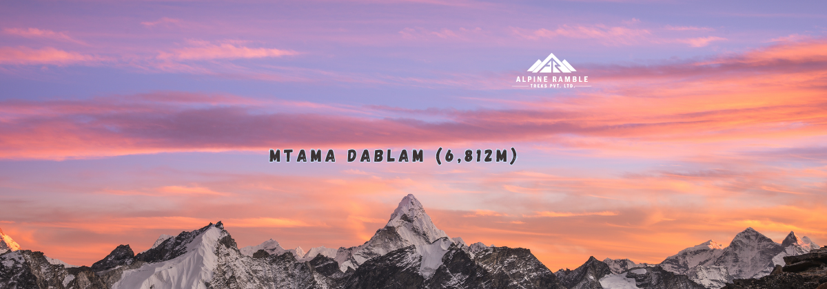
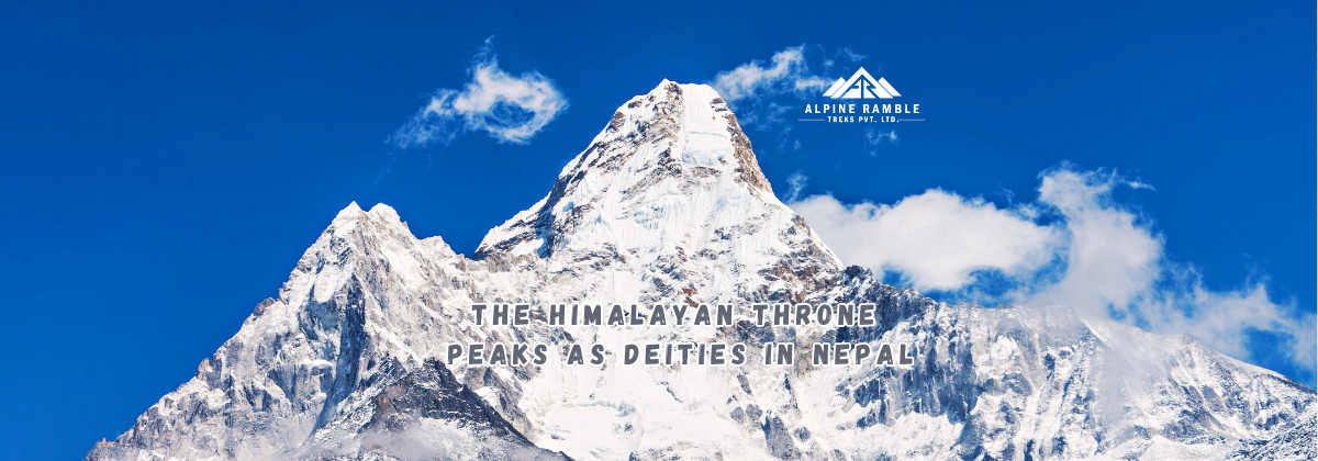
Discover the rich history and modern significance of Mt Ama Dablam, a mountain revered for its beauty and cultural heritage.
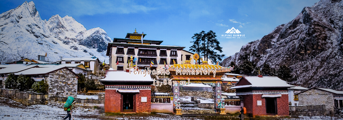
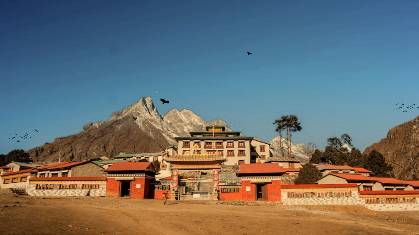
Discover the spiritual and historical significance of Tengboche Monastery, a must-visit destination for those in their 20s seeking adventure and reflection.
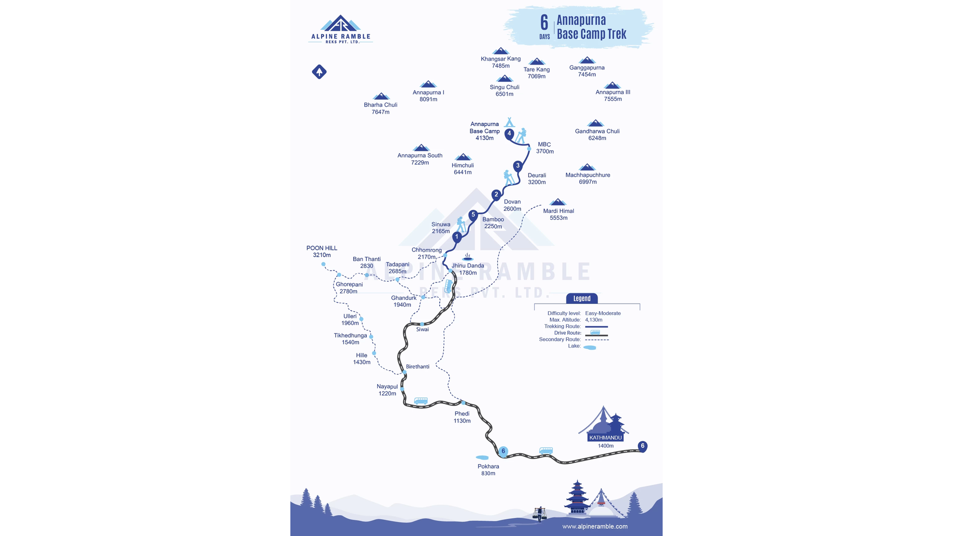
Explore the unspoken pull of travel and the transformative power of the Annapurna Base Camp Trek, a journey that resonates with the inner life of those seeking alignment before the age of 30.
Explore the rich history and significance of Halesi Mahadev, a revered site in Nepal that intertwines spirituality and culture.
Discover how the trek to Ama Dablam Base Camp offers an unparalleled experience for adventure seekers and nature lovers alike.
Explore the rich history of Chitwan, from ancient times to the establishment of Chitwan National Park.

Discover essential tips and insights to navigate Nepal's stunning landscapes, rich history, and vibrant culture. This guide is tailored for first-time visitors, covering everything from Kathmandu to Janakpur.
Exploring the profound spiritual significance of Gosaikunda, a sacred alpine lake in Nepal, beyond its adventure tourism appeal.
Discover the surprising cultural significance behind Namche Bazar's Irish Coffee, where the drink transcends its ingredients.
Explore the captivating history of Saipal Lake, a hidden gem in the Himalayas, known for its natural beauty and cultural significance.
A reflective journey exploring the emotional transformation experienced by trekkers returning to Lukla after their Everest trek.
Exploring the profound beauty and tranquility of the Gosaikunda Trek, where nature invites reflection and stillness.
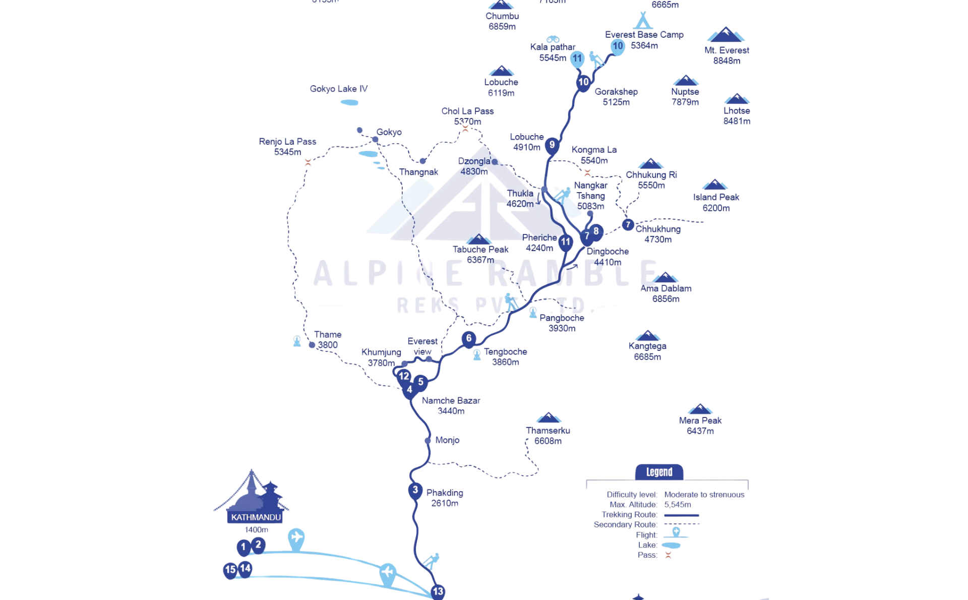
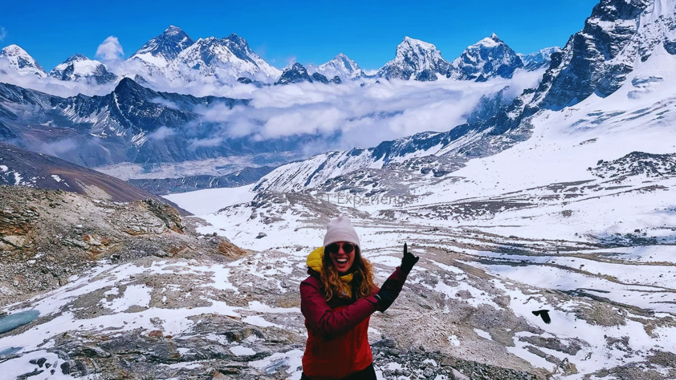
Explore the tranquil beauty and spiritual significance of the Everest Three Passes trek, a journey through breathtaking landscapes and rich cultural heritage.
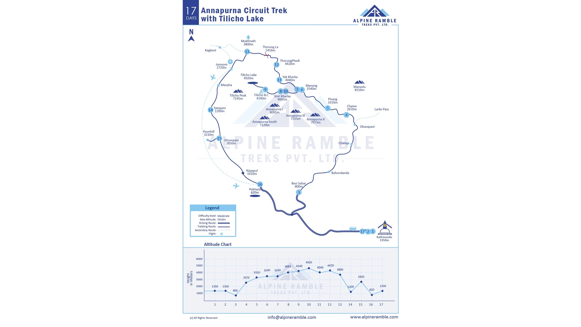
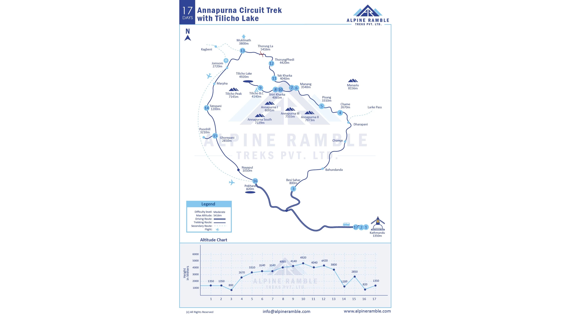
Discover how Lamjung serves as a vital hub for trekkers on the Annapurna Circuit, offering stunning landscapes and rich cultural experiences.
Explore the rich history of Island Peak, a mountain that serves as a testament to human ambition and the evolving nature of mountaineering.
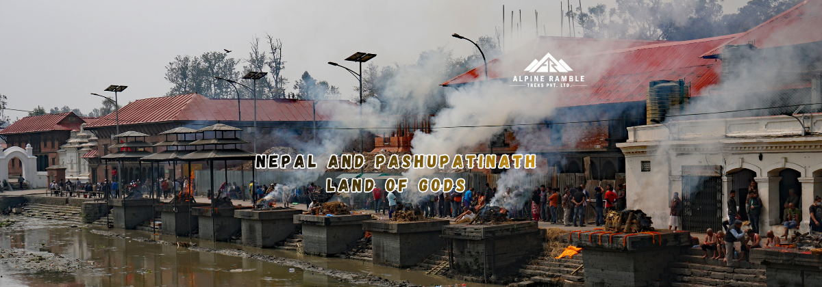
A historical examination of Nepal as a sacred geography, with Pashupatinath as its civilizational axis.

A reflective journey through the legacy of the Himalayas and the stewardship of Dil Gurung, intertwined with the history of Sir Edmund Hillary and the spirit of the Kingdom of Nepal.
Exploring the nuanced role of Mithila Brahmins within Nepal's sacred statecraft, emphasizing their contributions to architecture, literature, law, and ritual timekeeping.
Exploring Lumbini, the birthplace of the Buddha, and its profound impact on spirituality, culture, and tourism in Nepal's Terai region.
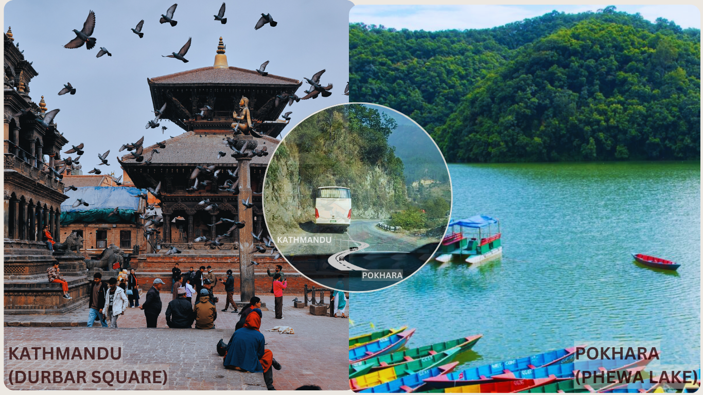
Discover the Kathmandu Valley, a pivotal center of civilization where the divine and human realms converge.
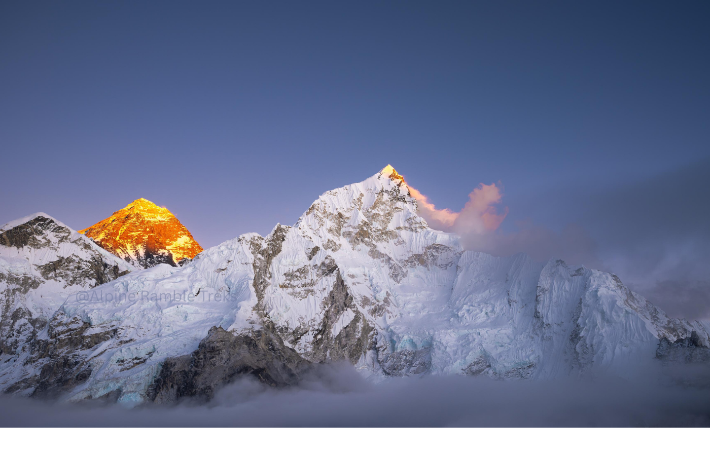
Discover the sacredness of Nepal's Himalayan peaks, where mountains are revered as deities, and trekking becomes a pilgrimage through a land rich in culture and spirituality.
Explore the sacred geography of Nepal, where the divine meets humanity across the majestic Himalayas and the lush Terai.
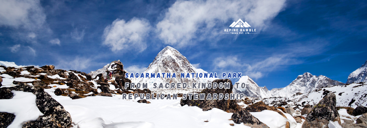
Explore the transformation of Sagarmatha National Park from a sacred landscape governed by spiritual beliefs to a modern republican stewardship, highlighting the interplay of power, belief, and responsibility throughout its history.

Explore the vibrant café culture and social dynamics of Phakding, Namche, and Dingboche, where coffee, cake, and shared experiences create a unique social fabric in the Everest region.
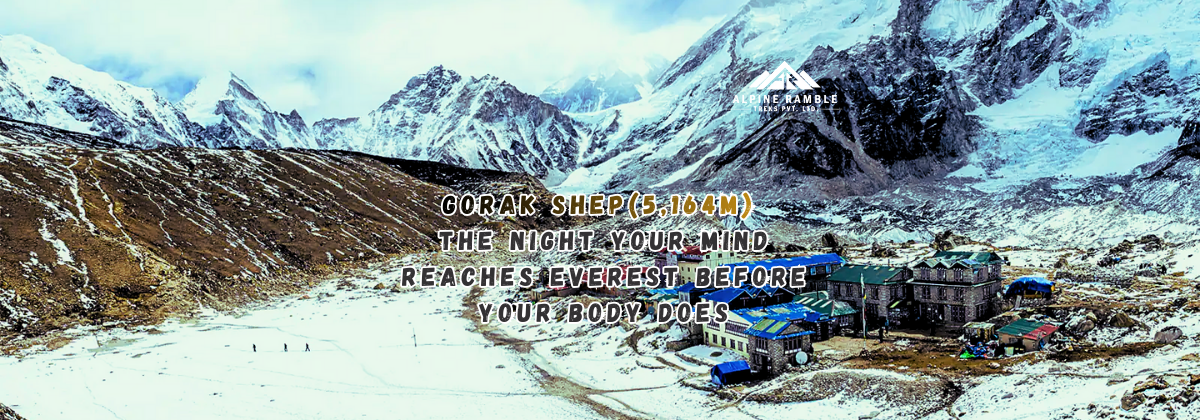
Explore the psychological and physiological challenges of Gorak Shep, the last stop before Everest Base Camp, and understand why it serves as a critical mental threshold for trekkers.
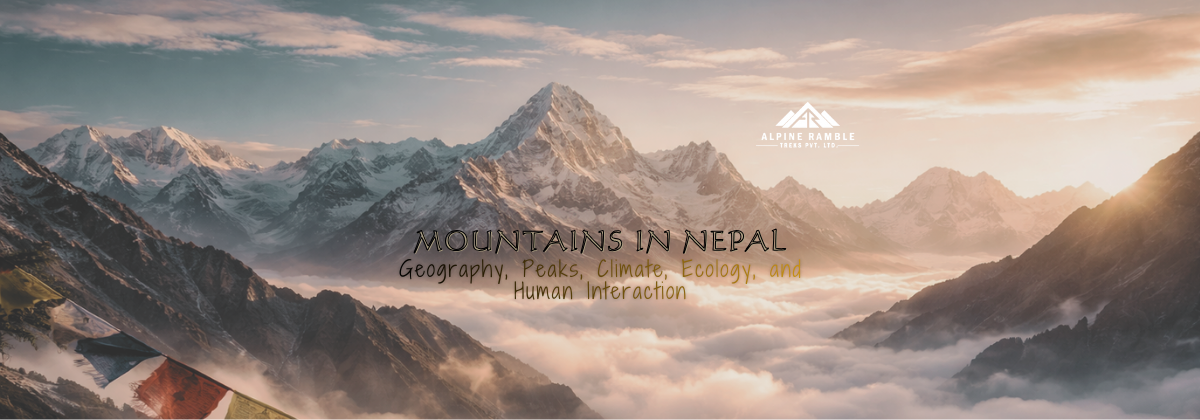
An in-depth analysis of the geographical features, climatic conditions, and ecological significance of the mountains in Nepal, tailored for an expert audience.
A high-intelligence historical narrative that explores Nepal’s state formation, endurance, sovereignty, and civilizational continuity from the unification era to the modern republic.
Discover the profound significance of Ama Dablam Base Camp in the Everest region, a journey that enriches your Himalayan experience.
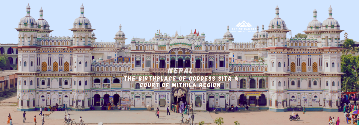
Explore the historical significance of Mithila as a kingdom and the birthplace of Goddess Sita, rooted in the rich cultural heritage of Nepal.
Explore the historical significance of Changu Narayan Temple, Nepal's oldest recorded temple complex, and its role in the legitimacy of kingship through the ages.
Explore the historical, ecological, and policy-driven reasons behind the stringent protection of Bardiya National Park, Nepal's largest lowland national park.
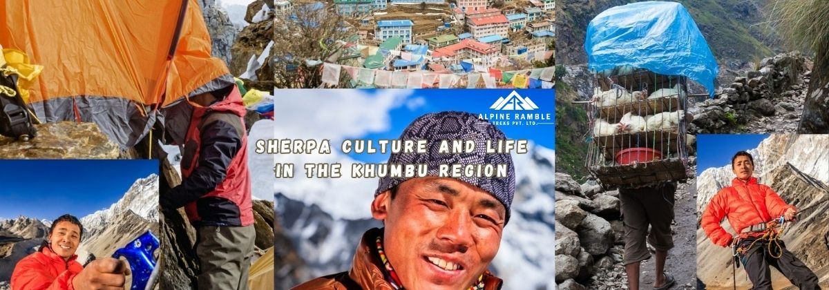
Explore the unique characteristics of the Khumbu Region of Nepal, where geography, culture, and history create a world apart from modernity.
Explore the vibrant festivals of Nepal, from Dashain to Buddha Jayanti, and immerse yourself in the rich tapestry of Nepalese culture.

Explore the historical significance of Simraungadh as the capital of the Karnata dynasty and its role in the Mithila Kingdom's political landscape.
Exploring the emotional and sensory journey of arriving in Besisahar, a gateway to the Himalayas.
Delve into the rich, layered history of Upper Mustang, a kingdom that has resisted the tides of time, culture, and politics, preserving its identity against the backdrop of a changing world.
The Everest Base Camp trek is more than just a place to go. It has beautiful scenery, a rich Himalayan culture, and deep spirituality. It provides a genuine look into the heart of the mountains and the people who call them home.
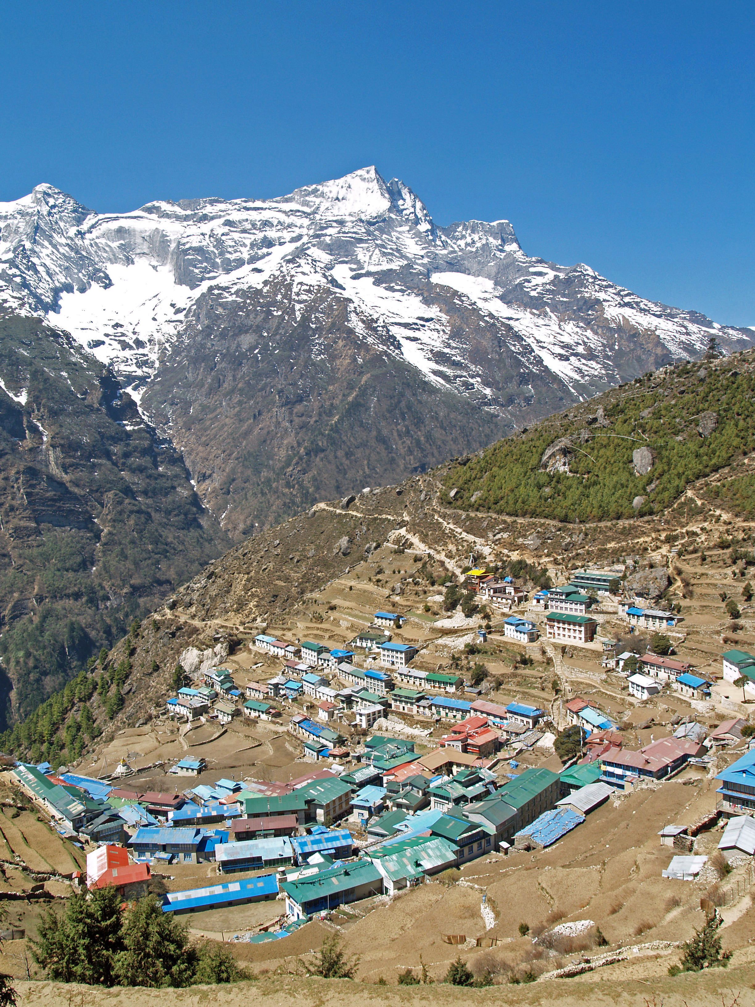
Namche Bazaar is a starting point for a number of treks and expeditions in the Khumbu, including the Mount Everest expedition and the Everest Base Camp Trek.
The Sherpa are an ethnic group native to the mountainous region of Nepal.
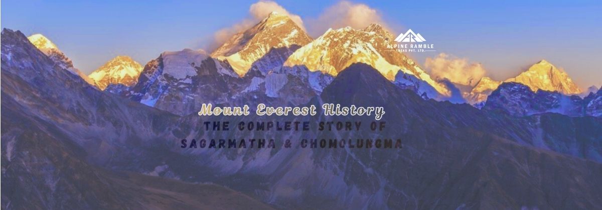
Mount Everest’s history is a story far greater than the mountain's fame. Known globally as , locally as Sagarmatha (“Forehead of the Sky”), and spiritually as Chomolungma (“Goddess Mother of the World”), this legendary peak stands not just as Earth’s tallest mountain but as a timeline of humanity, geology, mythology, and exploration.